Subscription acquisition


The Problem

The business needed to move the Everyday Extra subscription service from the primary tab in the Rewards app to make room for the expanding EDR Shop offering. However, with 80% of subscriptions originating from the app, visibility was critical.

Losing prime real estate risked:

  • Reducing organic acquisitions.

  • Limiting easy access to benefits for existing subscribers.

  • Decreasing awareness of the subscription’s value proposition.


 Insights & Challenges

Research showed that customers primarily used the app to:

  • Boost offers

  • Access their digital card

  • Check points, receipts, and rewards

While Everyday Extra had a strong subscriber base, it wasn’t always top of mind—even for members. Instead, customers were more focused on specific benefits while shopping, rather than navigating to the Extra tab.

Engagement data reflected this behaviour. The Extra tab had just 1.4M monthly visits (700K unique), making it the least-visited tab in the app, other tabs saw significantly higher traffic:

  • Wallet: 2.5M

  • Activity: 4.5M

  • Discover: 12M

  • Home: 27M

With such low engagement, removing the tab meant losing a key entry point for acquisitions and subscriber access to benefits. The challenge was finding new, high-impact placements that ensured Everyday Extra remained visible and relevant throughout the customer journey.


Discovery

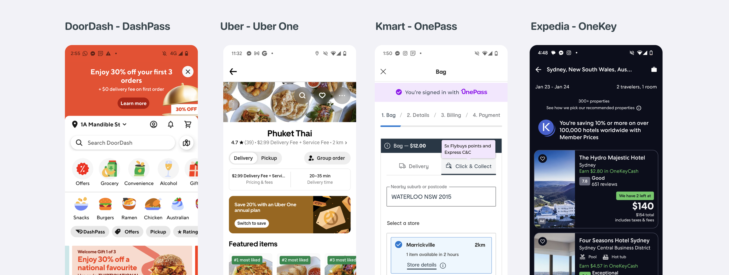
A review of subscription services across various apps revealed a key trend: organisations are integrating subscriptions seamlessly within key user interactions rather than using a dedicated tab. This approach highlights value at the right moments, enhancing personalisation and user experience. Notably, no app reviewed featured a standalone subscription tab, reflecting a shift toward a more embedded, user-centric model and account based subscription management.


Subscription Strategy

Enhancing the Subscriber Experience

Insights from analytics informed us that only 26% of clicks through to the extra tab were from subscribers suggesting that once past acquisition there were minimal reasons for customers to re-access the tab. We knew from prior research that subscribers most valued Immediate access to benefits and promo codes and Helpful content which would provide relevant insights to support decision-making.

With this in mind we identified 4 areas to focus discovery, we could;

  • Surface key Everyday Extra functions via a homepage entry point

  • Integrate benefits into the shopping journey (Woolworths & BIG W)

  • Reinforce value at decision-making moments to drive retention

  • Use the Notification Centre for targeted messaging

Driving Subscriber Acquisition (Phase 1 Focus)

For non-subscribers, acquisition was the main driver: On average we were seeing 54k clicks per month on the free trail CTA from within the tab, with 22k signups which was a 41% conversion rate. We needed to make sure we continued and improved this over time.

  • Surface missed and potential value at crucial touchpoints

  • Leverage high-traffic areas within the EDR ecosystem

  • Rethink Everyday Extra placement in Account & Activity sections 

By strategically repositioning Everyday Extra across the app, we aimed to reduce acquisition loss, enhance engagement, and maximise retention, ensuring that its value remained front and center for both potential and existing subscribers.


Opportunity mapping

By mapping the current experience and identifying key moments in the customer journey—along with high-traffic areas and key Jobs to be Done (JTBD) within each part of the app—we were able to pinpoint the most impactful focus areas.

Reaching customers at the right moment with the right messaging was crucial. The Activity tab, the third most visited page in the app, sees users returning an average of 3–4 times per month. However, visibility for Extra remained limited, presenting a clear opportunity for optimization.

The primary Jobs to be Done for the Activity page were:

  • Checking point totals per shop

  • Reviewing e-receipts for savings, returns, and overall spend

Since customers were already in the mindset of reviewing past purchases and points, this provided a strong foundation for exploring a range of strategic concepts.


 Concepts

Having explored multiple ideas we we identified three strategic approaches to drive increased acquisition that we would conceptualise for customer testing.

1. Highlighting Missed Value

This approach showed customers what they could have saved in the past month if they had signed up for Extra. We calculated the biggest basket saving with 10% off and total monthly points with 2x points to demonstrate potential benefits.

2. Unlocking Value

Instead of focusing on lost savings, this approach positioned sign-up as a way to retroactively access past savings. For example, customers could “unlock” their missed savings if they joined Extra. We also emphasized the free monthly perk, ensuring visibility to encourage sign-ups for the free trial.

3. Showcasing Long-Term Savings

Here, we highlighted the average savings a customer could accumulate over a year, using a larger, more impactful number to drive conversion.

Additionally, we tested a direct approach—educating customers on Extra’s core benefits (10% off and 2x points) without framing it through past or future savings.. We conducted testing with six non-subscribers, each with varying levels of awareness about Extra as a service.


Insights

Through the testing we came out with some clear insights:

  1. Personalisation Enhances Value: Users respond well to personalised information, especially with their name, reinforcing program value.

  2. Clarity Drives Engagement: Ambiguous data (e.g., calculations, visuals) leads to user confusion and disengagement.

  3. Significant Value Motivates: Users are motivated by clear, tangible, and substantial rewards and savings.

  4. Urgency/FOMO Increases Action: Creating urgency (time limits) and highlighting missed opportunities drives user engagement.

  5. Discoverability Influences Usage: Feature placement and visibility within the app greatly affect user interaction and adoption.

  6. Points vs. Dollars: Users have varying preferences for seeing points or dollar amounts. Some prefer the tangible value of dollars, while others are more motivated by points accumulation.

The testing underscored the importance of clear, personalised, and value-driven communication to effectively engage users with Everyday Extra. Based on the insights from the testing, we recognised the need to design a solution that would allow us to test and refine different messaging strategies. Given the high traffic on the activity feed, it made sense to focus our efforts there by utilising An in-feed banner which would enable us to run both ATL (above the line) and BTL (below the line) campaigns, using targeted and generic messaging. Additionally, with the ability to A/B test through Adobe Target, we gained the flexibility to experiment and optimise our approach in product. 


The final design 

The final design featured an in-feed banner adaptable to various messaging and imagery. To ensure flexibility, we created three versions—small, medium, and large—allowing for dynamic positioning and customizable background colors. This also enabled other EDR services to leverage the banner as needed.

For the initial test, we used the banner to promote Extra during a Half Price Sale. Over a two-week period, it achieved a 5.99% click-through rate, delivering promising early results.